Why Parametrics?

Hi! Welcome to a short series of posts that I hope will help get more people started with graphing using parametric equations.

If you’ve read my posts before it may not surprise you that I love parametric equations more than rectangular or polar equations. But if you’ve ever wondered a) “What are parametric equations?” or b) “What’s all the fuss? I’m perfectly happy graphing without them, thank you very much.”, this post is for you. If you already know what they are and you’ve been wanting to give them a whirl, then you are in luck, friend! This whole series of posts is for you.

1) What ARE parametric equations?

Instead of defining an equation with x and y in terms of each other, we define our set of coordinate pairs in terms of a third parameter. Sounds tricky, but it’s a lot simpler than it might sound. For a specific example (that I happen to think is a great one), let’s talk about the circle. For now, we’ll look at one with radius 1.

You’re probably familiar with its rectangular form: x^2+y^2=1

And you might be familiar with the polar form, so beautiful in its simplicity: r=1

Now for parametric equations.

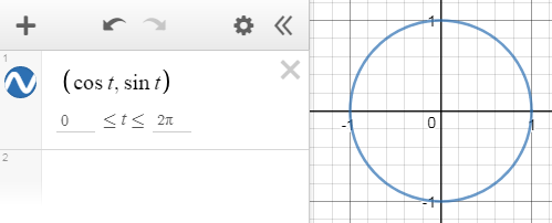
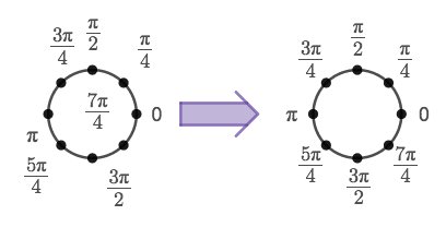
Remember our good friend from precalculus, the unit circle?

One of my favorite cute little features of this circle is this:


parametric blog unit circle

Every point on the unit circle can be written as \left(\cos a,\sin a\right).

Wanna know the parametric equations? You’re looking at them! x and y are both defined in terms of the parameter a.

x=cosa
y=sina

Instead of just a single point,  we are graphing for a whole set of a values.

To get an entire circle, we’ll need to graph all the points from 0 to 2π radians.

(And if you’re more comfortable with degrees, just switch to degree mode and use 0 to 360.)

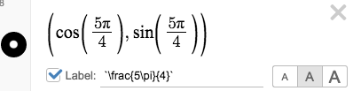
In Desmos, instead of defining x and y in separate lines, we just write them as an coordinate pair: (cost,sint).

Woah, woah, woah. Back up a second. Where did that t come from? Well, remember, this is math, and we can use whatever parameter names we want! (Parameter = fancy word for variable). Desmos likes t for parametric equations, not a.

Here’s how it looks in the expression list:

Parametric Unit Circle

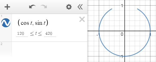
And because we get to define which angles we want to graph, it’s super easy to graph whatever arc we want by just changing the domain:

Parametric Unit Circle 1

Parametric Unit Circle 2

And now in degrees mode:

Parametric Unit Circle 3

So. What’s the fuss? This looks harder. It looks meaner. It looks, well, unfamiliar! And learning something new takes work! Why bother?

2) Why parametrics?

There are many reasons parametric equation are beautiful. We’ve already seen that for circles, it makes drawing a particular arc super as simple as changing the domain of t.

For this particular post, I’m going to focus on how delightful transforming parametric equations can be

Let’s stick with our circle for a few moments longer.

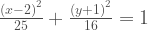
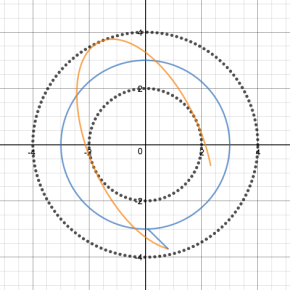
For a lot of us, we first learned rectangular form of the circle, and this is our happy place. It’s familiar and we love the connection to the Pythagorean Theorem. But the downside is that it’s not super easy to do transformations. Translating is fine, and changing the radius is ok, but it’s kind of a pain to do separate vertical and horizontal stretches (aka make an ellipse).

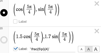
Here’s an ellipse with a vertical stretch of 4 and a horizontal stretch of 5 that I then translated right 2 and down 1: \frac{\left(x-2\right)^2}{25}+\frac{\left(y+1\right)^2}{16}=1
Ugh. Not my favorite. at. all. And when we translate, we have to do the OPPOSITE of what we want. I mean, if we want to shift right two, we have (x-2)^2 instead of what seems more logical: (x+2)^2. Ack. Why, math, WHYYYY?

And although polar form makes resizing this circle a pure joy, it’s a beast to translate anywhere. Oh, I’m sorry, you wanted to stretch the circle by different amounts vertically and horizontally? And then translate it? Good luck with that. If you make it happen, please, PLEASE comment below so we can all ooh and ah at the craziness beauty of it.

Now, parametrics are a different story entirely. Transformation headaches? BAH. A thing of the past. Welcome of transformation heaven. There’s none of this “subtract 4 to move right 4” nonsense. Or, in the case of a function y=f(x), “if it’s inside the parentheses, multiplying by 1/2 stretches the graph horizontally, but if it’s outside, multiplying by 1/2 compresses the graph vertically.” SMH

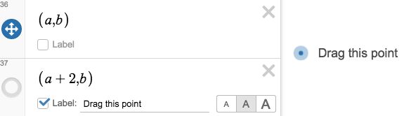
To transform parametric equations, it’s the same as transforming a single point. Multiply by a and b, your respective horizontal and vertical scale factors, and then shift by h and k.
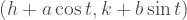
\left(h+a\cos t,k+b\sin t\right)

For example: \left(-3+2\cos t,5+7\sin t\right) is a circle transformed into an ellipse. It has been stretched by a factor of 2 horizontally, and 7 vertically, and then moved left 3 and up 5.

B-E-A-U-tiful!

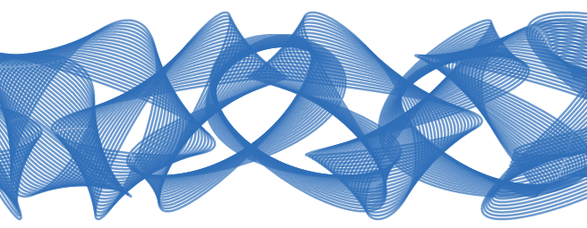
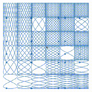
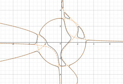
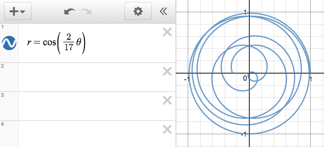
And the same is true for all parametric equations. Here’s one of my favorite non-circular parametric equations, a Lissajous curve.

Lissajous

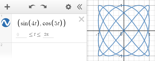
Play with transforming it here: https://www.desmos.com/calculator/kr6nojjtct

Stay tuned for more parametrics posts!!

Making a Great Desmos gif

Hi! It’s Halloween, and I’m loving the #mathoween graphs people are posting. Ever wonder how people are creating beautiful gifs of their graphs?

There’s gifsmos.com, but I haven’t found the image quality to be quite what I’ve been looking for.

Here’s my method for making pretty gifs:

  1. Take a screen recording with your slider speed set to 1x and only forward looping. (I have used both screencastify (on my PC) and QuickTime (on my Mac). I prefer QuickTime, but both are fine.) Make sure to take a little more than a full loop of your slider (more than 4 seconds.)
    slider loop
  2. Save the video file to your computer.
  3. Go to this site: ezgif.com and upload your video. It accepts most video formats.
  4. Since you set your slider speed to 1x, it should take exactly 4 seconds for your animation to loop back to its start. So specify start and end times to your gif that are exactly 4 seconds apart. (I usually just use 0 and 4, but you could use 5.2 and 9.2 or any start and end times that are 4 s apart.)ezgif settings
  5. Make any adjustments you may want using the menu they provide. I often crop, resize, and/or adjust the speed.
    ezgif options
  6. Download your gif by pressing the save button all the way to the right.
  7. All done!

Hope this helps you with your gif-making endeavors!

Stay Put! (When Labels Go Bad…)

It really has been way way way too long since I’ve written a blog post.  A lot has been happening in my life: namely a new child. And she is lovely. So lovely. But in the months leading up to her birth, life got uber crazy busy, and in the weeks after her birth, it was a challenge to get time for a shower, much less to write a blog post.

But, as things do, life has settled a bit, and lately, I’ve been doing some fun graphing. I hope to get back into blogging by writing some short posts on little hacks I use to make my graphs more beautiful, or more usable in a custom activity on teacher.desmos.com.

Today’s topic? Label positioning.

One of the things that I both love and hate (ok, maybe more like “am a little annoyed by”) is the auto-positioning labels in Desmos.

Why I love them: They automatically place themselves rather nicely, and get out of each others’ way as you move things around. For diagrams where there are a lot of moving parts that have labels, this is amazing.

Why I sometimes want to have them stay put instead: there are times when a graph looks WAY nicer if the placement of the labels is exact and unchanging.

So. Here’s how to take your labels from scattered, random placement to a beautiful layout (when that sort of thing matters).

label position 5

Here’s the hack. It’s so simple.

Did you know that when you turn off a point that is labeled, the label will remain positioned centered over that point? So if you want to have a label stay at a specific location, just put a point at that spot, then leave the label on, but turn the point off.

So in the first graph above, I only graphed each of those 8 points once. Each is labeled, but the labels place themselves automatically, leading to a scattered appearance.

label hack 0

In the second, I actually have 16 points graphed…8 which you can see around the circle, and 8 just outside that, where I’ve turned the labels on, but the points themselves off.

label hack

It’s a simple hack, but a great one.

Want to do the same for a movable point?  Same deal:

label hack 2

That’s it from me!  Happy graphing!

A Graphing and Learning Journey

After a little archaeologic research, I can tell you that my earliest saved Desmos graph is from March 26, 2014.  That’s just over three years ago.

I remember thinking then what a game changer Desmos was. I was stoked about how this could potentially transform teaching.  The graphs!  They were dynamic! And you could graph even non-functions. And the graphs were pretty!  I was truly in love and I thought about how finally (FINALLY!) my students could visualize the beauty and wonder of math in a way they had never been able to before.

This was going to change things for my students. I was 100% sure of it.

And I wasn’t wrong. But that’s not what I’m here to tell you about. 

What I never imagined was the profound impact using Desmos would have on my own mathematical understanding.

Through making more and more involved and intricate graphs, I have discovered myself learning how to do things I never ever imagined I would be able to.  And how did I learn it? Through a little bit of research combined with a whole lot of thinking, graphing, and playing.

Bear with me here for a quick walk down memory lane:

2014: A year of using Desmos to do teacher-y things I would normally have just used a TI calculator to do.  (plus a little more than TI does…like an awesome movable tangent line! Go Desmos!)

2015: A year of getting a little more creative with my graphs. A fish? With chomping teeth? Wowza. That’s some pretty sweet stuff. And check out the shading on that beach umbrella. Is it any wonder Desmos is my latest favorite thing?

2016: The year everything changed.


This pentagon construction? This is the graph that changed everything. This graph taught me more about using and writing parametric equations than I ever learned from a mathematics course.

Pentagon Construction (2)

And since then, I have continued to learn about parametric equations, about writing and composing functions, and about using sliders & lists to get some beautiful graphs:

cross sections - proportional rectangles

Ellipse

Heart Chain Reflect over Circle

Light Art

Lissajous

Non-Function AsymptotesParametric Butterfly

If you had told me in March of 2014, when I had saved my first graph, that in 3 years’ time I would be writing the equations for graphs like these, I would never have believed you.  And yet, it happened.

Desmos is not only a powerful learning tool for our students, it is a powerful learning tool for us, the teachers.

If you’re a math teacher, I challenge you to begin getting inspired to create graphs. There is so much to learn, all of which can enrich your content knowledge and help you to become a better teacher for your students! If you’re not a math teacher, but just like graphing for fun, keep at it!!!!!!!

Where can you get inspired?

  • Start following people on Twitter who are doing interesting mathy graphy things.
  • Check out Dan Anderson’s site: http://dailydesmos.com/.
  • Try some graphing challenges from learn.desmos.com.
  • Or? Look for inspiration in your daily life. Are you watching raindrops hit puddles? Maybe consider making ever-expanding concentric circles! Are you watching a bicyclist pedaling down the road? Try graphing the path the pebble takes!

For me, the next challenge is to make a tornado (at the request of a student.)  Keep an eye out for it on Twitter!

Happy graphing, people! And happy learning.


*link to the title graph.

Light Art

Changing the Domain of Polar Graphs

In today’s post: a work-around for specifying the domain of a polar functions. (hint: it involves a quick switch to parametric equations.)

What’s your favorite type of equation? I have always loved polar equations, but in the last year or so, parametric equations have taken polar’s place as #1.  This post may help to explain one of the reasons behind my change of heart.

Graphing polar functions is super fun. The curves polar functions generate are fun and unexpected. And when you graph them on Desmos, they’re simply stunning. But as of right now, you cannot specify the domain of a polar function on Desmos.  As far as I can tell, it will only draw polar graphs for values of θ from 0 to 12π radians:Polar Spiral

This suffices for many basic graphs, but even in the case of this spiral, it means that we aren’t seeing the whole picture.  For example, what happens when θ is negative? What about for larger values of θ? Continue reading

My Favorite Thing

It’s coming up on one year since I launched this blog, and in honor of the #MTBoSblogsplosion, I’m actually writing my 2nd post just this week.  It’s fitting that the prompt is “My Favorite Thing,” because that’s literally what this entire blog is all about.

I mean, don’t get me wrong, I have more than one favorite thing. I like cooking, baking, dancing, singing, mathing, drinking tea, breathing in the springtime air as the ground is just thawing.  I have lots of favorite things.

But ask my students what my favorite thing is and they will all, without hesitation, tell you it’s Desmos.  They’ve all come to expect that on Fridays I wear Desmos shirts.  And they pretty much think I spend all my free time playing on Desmos.  They also all know how to sing the Desmos song I wrote.  Well, it’s more of a “jingle.”  You can sing it too!  Here’s how you do it.  You sing in the highest note you can, with the most enthusiasm possible “Des-mooooos!”*

Adults also know Desmos is my favorite, but they’re skeptics and require some winning over (which usually just consists of them actually trying it). This fall I was fortunate enough to be a part of Desmos’s first ever Teacher Fellowship Cohort, where I had the opportunity to go out to Desmos HQ in San Francisco. People warned me: make sure it’s not like a time-share, where they’re just trying to sell you something. There are also people who think I’m just promoting Desmos so much because I must be getting something out of it.

Honey, please.

Desmos didn’t come find me. I sought them out. Continue reading

Illustrating Volumes of Solids with Known Cross Sections

My posts are few and far between these days.  I hope that changes soon, but for now, it’s just a post here and there when I can.  And today I can!  Let me share some fun Desmos-ing with you!

cross-sections-2

In this post:

  • A new Desmos feature: how to use labels!  
  • Attending to the clarity and usability of graphs.  
  • Fun cross-sectional solids graphs to play with!!  What could be better?

It’s no secret with my colleagues that I love Desmos.  For real. SO. MUCH.  And I love it when people ask me to help them look for Desmos graphs or activities for particular topics.

Which brings us to today. One of the calculus teachers I work with was asking me about whether I knew of any good Desmos graphs of rotational solids.  I sent him some awesome graphs made by Geoff Patterson.  Graphs that use such advanced math that my jaw drops with awe.  Seriously.  If you haven’t given his blog a look, do yourself a favor and check it out.  Pronto. Here’s a link: http://www.geoffofx.com/.


732203_orig
This picture is of one of Geoff Patterson’s creations. Image can be found at http://www.geoffofx.com/uploads/1/5/8/9/15895202/732203_orig.png

But what I didn’t know Continue reading

A Walking Machine

Hi everyone!  Due to an incredibly busy end to the school year and start to the summer, I’ve been MIA, with no new blog posts in a few months.  But I’m back.  This post is inspired by a gif my brother-in-law shared with me from Beautiful Engineering’s Facebook page.  Here it is:

tumblr_m2y9knsz7n1rsz0ajo1_500

In the comments, someone mentioned that it looked like one leg of a walking machine.

As soon as I saw it, I thought it looked like something I could create in Desmos.  So I did.  Here’s what I ended up with:

gifsmos

My best friends for this project were the Law of Cosines and parametric equations.

In order to trace the curve, I had to write nearly everything in function notation.  If you want to play around with any of the parameters, you can open the folders and try to make sense of it, but if there’s one thing I’m still learning, it’s how to make a Desmos graph that I can look back at later and understand.  For this graph in particular, what makes my work hard to follow is the fact that I wanted to make the yellow segments have variable lengths.  So each of their lengths is L1, L2, L3, etc. There was no good way to denote which length went with which segment, so I did what I could.  Either way, it was a lot of fun to put this together.

By changing some of the lengths of the segments involved, here are some of the other versions I ended up with.  Click the image to go to the graph.

The Birthday Problem

It’s been a couple of weeks since I last posted.  Things have been BUSY!!  I have been Desmos-ing quite a bit, just haven’t had a chance to write about it.  Here’s a little post about one illustration I enjoyed creating on Desmos lately.

In Pre-Calculus, the students at our school are just beginning to learn various counting principles and ways to calculate probabilities.

One of my favorite probability questions is “The Birthday Problem.”  If you’re not familiar with it, here it is:

What is the probability that at least two people in a room with n people in it share the same birthday (not counting year)?

The answer is a bit counter-intuitive (as are many questions in probability).  In fact, in a room with just 23 people in it, the probability of two people having the same birthday is already better than 50%.

Here’s a fun little Desmos graph to illustrate the probability for different values of n (based on a 365 day year).  The black points represent the falling probability that each person in the room has a unique birthday.  The chances that at least two people share a birthday is shown by the green points.

Birthday Problem.JPG

If you’ve never explored this problem before, despite its surprising result, it isn’t terribly challenging to do the calculations.

Wikipedia does a decent job of explaining the problem in more detail,  or you can also go to Wolfram Mathworld for a bit more of a math-intense explanation.  🙂  Loving Desmos!

Circular Thinking

My freshman geometry class has been asking me all year when we would be able to use Desmos (they know how much I love it.)  Now is there time.  We are doing a whole unit on coordinate geometry, and so we’ve been Desmos-ing it up.

Here’s the activity we did in class: Circles Activity.

One of the slides in the activity allowed the students to make a simple drawing out of circles.  I suggested a Mickey Mouse silhouette or the Olympic Rings.

While most students decided to make the Mickey Mouse Silhouette, a couple went a bit further, one even asking how to make an ellipse.

Circle Activity Screenshot.

Face 1

Of course, working with circles got me to thinking about them.  In particular, I got to thinking about how to make use of lists to get Desmos to graph some pretty cool sets of circles.  Here’s one that I came up with:

gifsmos (3)

…and that led to a quick exploration of cycloids and epicycloids…

Cycloid and Epicycloids:

gifsmos (5)

…followed by a little project to trace the path made by the center of a circle that rolls over a sine curve.  Here’s what I came up with:

gifsmos (7).gif

I’m pretty sure that my way of making this happen is not the most efficient way.  Do you know a better way to do this?  Let me know in the comments!

Thoughts for where to go from here: at some point, I’d like to trace a point on a the edge of a circle as it rolls over a sine curve.